Dropdown
Jump to navigation
Jump to search
Menus are just being adopted, many of these ideas can change. The dropdown menu is used in different places with slight variations.
- The search pulldown in the main toolbar
- The action pulldowns in section headers
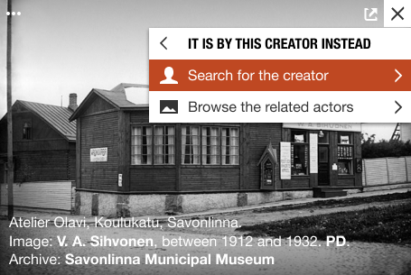
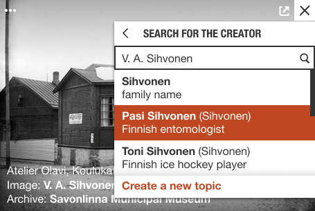
- The image action pulldowns over images
Basic structure
- The menu is displayed by an icon in the toolbar
- On hover it is displayed negative.
- On toolbars the icon is black, negative is a white icon in black background. The background is 100% height of the containing toolbar (40x40px).
- On an image the icon is white, negative is black on white square 30x30px.
- Basic menu with selectable rows
- Persistent menu for nested elements
- Settings panel is a flyout menu. It needs to stay visible and not disappear with mouseout.
Different rows
- Title row, same for all menus
- Row with a submenu or a link to a modal or a tool is displayed with a caret pointing right at the end of the menu item.
- Subselection inside dropdown row is ore instant.
- End row: Create item, show more, show all. One or more per row.
Other controls
- Long result lists can be displayed with a scrollbar

