Difference between revisions of "Dropdown"
Jump to navigation
Jump to search
(Created page with "The dropdown menu is used in different places with slight variations. * The search pulldown in the main toolbar * The action pulldowns in section headers * The image action p...") |
Susanna Ånäs (talk | contribs) |
||
| (5 intermediate revisions by one other user not shown) | |||
| Line 2: | Line 2: | ||
* The search pulldown in the main toolbar | * The search pulldown in the main toolbar | ||
| − | * The | + | * The pulldowns in section headers |
| − | * The image action pulldowns over images | + | * The image action pulldowns over images |
| − | Basic structure | + | == Basic structure == |
| − | * The menu is displayed by an icon | + | * The menu is displayed by an icon in the toolbar |
| − | * On hover it | + | * On hover it is displayed negative. |
| − | ** On toolbars the icon is black, negative is a white icon in black background. The background is 100% height of the containing toolbar. | + | ** On toolbars the icon is black, negative is a white icon in black background. The background is 100% height of the containing toolbar (40x40px). |
** On an image the icon is white, negative is black on white square 30x30px. | ** On an image the icon is white, negative is black on white square 30x30px. | ||
| + | |||
| + | ===Different menus=== | ||
| + | * Basic menu with selectable rows | ||
| + | * Settings panel is a flyout menu. It needs to stay visible and not disappear with mouseout. | ||
| + | |||
| + | ===Persistent menu for nested elements=== | ||
| + | <gallery mode=slideshow> | ||
| + | Image romove reasons.png|Persistent menu for nested elements Step 1 | ||
| + | Image Remove reasons menu 1.1.png|Persistent menu for nested elements Step 2 | ||
| + | Image Remove reasons menu 1.2.png|Persistent menu for nested elements Step 3 | ||
| + | </gallery> | ||
| + | |||
| + | ===Different rows=== | ||
| + | * Title row, same for all menus | ||
| + | * Row with a submenu or a link to a modal or a tool is displayed with a caret pointing right at the end of the menu item. | ||
| + | * Subselection inside dropdown row is ore instant. | ||
| + | * End row: Create item, show more, show all. One or more per row. | ||
| + | |||
| + | ===Other controls=== | ||
| + | * Long result lists can be displayed with a scrollbar | ||
| + | |||
| + | {{design-nav}} | ||
Latest revision as of 11:16, 26 August 2020
The dropdown menu is used in different places with slight variations.
- The search pulldown in the main toolbar
- The pulldowns in section headers
- The image action pulldowns over images
Contents
Basic structure
- The menu is displayed by an icon in the toolbar
- On hover it is displayed negative.
- On toolbars the icon is black, negative is a white icon in black background. The background is 100% height of the containing toolbar (40x40px).
- On an image the icon is white, negative is black on white square 30x30px.
- Basic menu with selectable rows
- Settings panel is a flyout menu. It needs to stay visible and not disappear with mouseout.
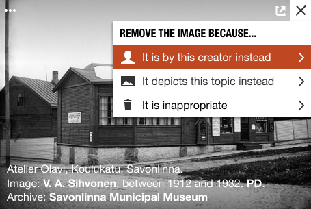
Persistent menu for nested elements Step 1
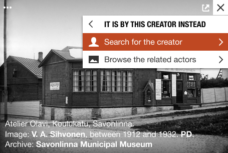
Persistent menu for nested elements Step 2
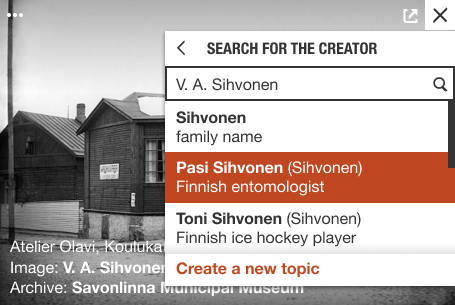
Persistent menu for nested elements Step 3


Different rows
- Title row, same for all menus
- Row with a submenu or a link to a modal or a tool is displayed with a caret pointing right at the end of the menu item.
- Subselection inside dropdown row is ore instant.
- End row: Create item, show more, show all. One or more per row.
Other controls
- Long result lists can be displayed with a scrollbar
| About | Technology | Design | Content modules | Tool pages | Projects |
| Status
Wikidocumentaries Slack |
Setting up dev environment |
Components |
Active modules Module ideas |
Visual editor | Central Park Archives |